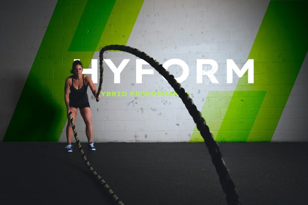
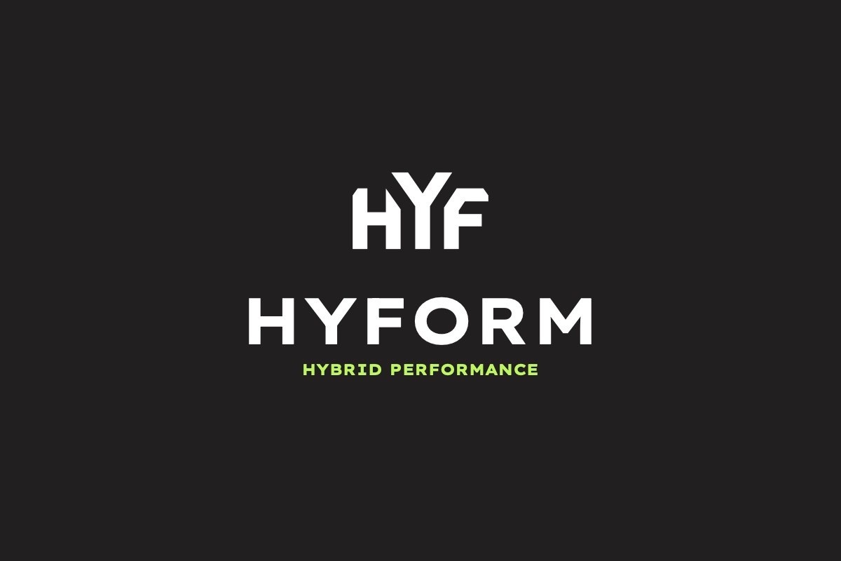
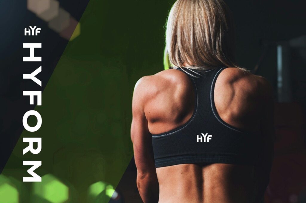
Hyform approached us as a fledgling gym concept with a clear mission—optimising human performance—but lacking the visual identity to match their expertise. Operating in a crowded fitness market dominated by either budget chains or luxury wellness clubs, they needed a distinctive brand position that communicated precision, results, and scientific rigour. We developed a complete visual identity system that positioned Hyform as the thinking athlete’s choice.
Brand Strategy & Positioning
Visual Identity Design
Healthcare and Fitness
Our approach.
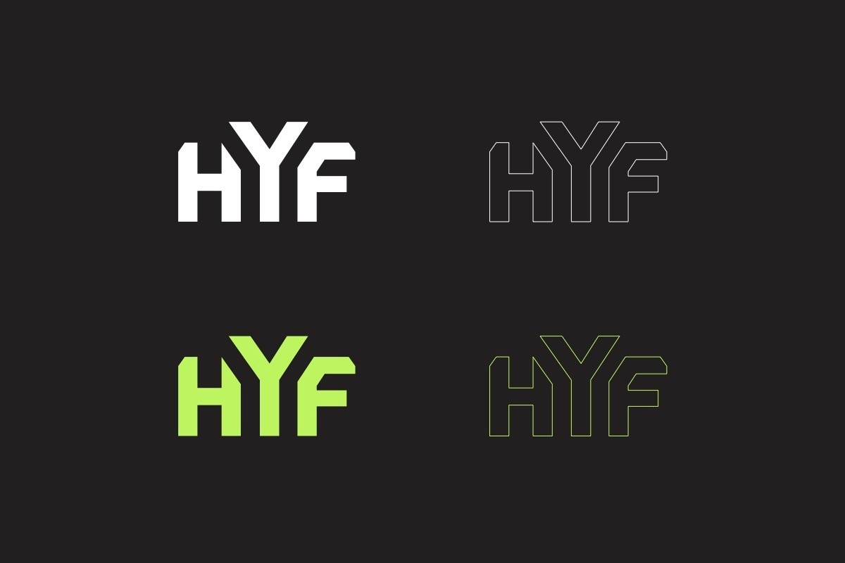
We began by interrogating what truly differentiated Hyform: their data-led, biomechanics-focused methodology. Rather than defaulting to fitness industry clichés of sweat and grit, we crafted an identity rooted in precision and progression. The visual language drew inspiration from performance metrics, clean architectural forms, and the geometry of human movement. Typography choices emphasised clarity and strength, while the colour palette balanced clinical professionalism with energising accents. We developed comprehensive brand guidelines covering everything from member touchpoints to digital applications, ensuring the identity could flex across varied contexts whilst maintaining coherence.
Cookies: We will only use your provided information to contact you.
Manage your cookie preferences below:
Essential cookies enable basic functions and are necessary for the proper function of the website.
You can find more information in our Privacy Policy and Privacy Policy.